
Web Forms
Optional Reading
HTML forms tutorials at https://html.com/forms/ and at https://www.w3schools.com/html/html_forms.asp
Communicating with Web Pages
So far we've seen how to create static HTML pages, and experienced a whirlwind tour of basic Java. We've seen how to make Java programs interactive, It's now time to see how to make web pages interactive as well.
Forms are the User Input part of a web page. They can take many forms, and many will seem similar to GUI objects we saw in the Swing section. As the reading mentioned, forms are comprised of text-input boxes, clickable buttons, checkboxes, and even pull-down menus and image maps. All of these items live inside of the <form> tag.
You can have multiple <form> tags in a document. Each <form> tag maintains its own local environment, that is, it can contain its own set of HTML tags, text, and images that are associated with that <form>.
Forms are activated when the user clicks on a designated "Submit" button. The web browser then takes the information entered in the form and wraps it up and then sends it to the server. It turns out there are two ways of sending the data to the server, the GET and POST methods. Each has its own strengths and weaknesses which we will discuss later.
The <form> tag
You can place a <form> tag anywhere within the <body> of an HTML/XHTML document. Any user interface components specified in the <form> are treated as images that are integrated with the HTML text.
The two required attributes for the <form> tag are:
Attribute |
Function |
| action | Gives the URL of the application that is to receive and process the form's data. |
| method | Specifies the method by which the browser sends the form's data, either POST or GET |
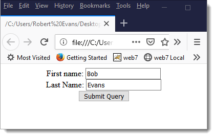
A very simple form is shown below:
<form action="https://localhost:80/TestProgram" method=GET>
<center>
  First name:
  <input type="TEXT" name="firstName" value="Bob">
  <br />
  Last Name:
  <input type="TEXT" name="lastName" value="Evans">
  <br />
  <input type="SUBMIT">
  </center>
</form>
The form above looks like this when loaded into a browser. Don't bother clicking on "Submit Query", as their isn't a server to listen to the request.
When to use POST or GET
You'll see that you often times can use POST or GET to get information from forms. Here are some rules of thumb:
- For best form-transmission performance, send small forms with a few short fields using GET
- If you have a lot of data (some OSs limit the length of the GET URL) use POST
- If security is an issue, use POST since GET places the values in the URL which are easily readable by others. Actually, all this does is not put the information in the URL. If you really want to be secure, you should be using HTTPS.
Available FORM components
Use the <input> tag to define a form control component. Components can be of the following types
- text fields
- text areas
- buttons
- checkboxes
- password
- file
- radio
- submit
- text
Text Fields
A text-entry field is usually blank, you can specify an initial value with the value attribute. If the user presses a form's reset button, the value of the field is reset to this value.
attribute |
function |
| type | identifies the type of the component, in this case type="text" or type=text |
| name | the label for this component |
| size | number of characters (size) of this field |
| maxlength | maximum number of characters that can by typed into this field |
| value | initial value for the field |
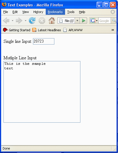
The following is an example of the definition of a textfield input form
<input type="text" name="zip" size="5" maxlength="5" value="20723" />
Text Areas
A textarea is a multi-line object, letting a user type in a large amount of information. On submission, each line of text is may or may not be separated by a carriage return/line feed character set and is then sent to the server. Note that text areas do not start with the input tag, but use a text area tag instead.
attribute |
function |
| name | the label for this component |
| cols | Number of columns |
| rows | Number of rows |
| wrap | off - no wrapping |
You can include initial (default) text if you place it between the open and close attribute tags:
<textarea name="bio" cols="20">
This is sample text.
</textarea>
Buttons
Buttons come in three classes
- Submit Buttons: The form data is sent to the servlet or server side program. If you have multiple submit buttons, you can provide a name tag to the button to identify which one has been pressed. Why have multiple submit buttons? Image an online store page, you might want to have an "Add Item to Cart" button and a "Delete Item from Cart" button. You can use the value tag to change the text in the button (It is "submit" by default).
<input type="SUBMIT" name="submit" value="send data"/>
- Reset Buttons: Resets the form items to the original value parameters. No data is sent to a server. Again, you can use the value tag to change the text in the button (It is "reset" by default).
<input type="RESET" value="reset"/>
- <button> buttons: Instead of using the "input type" to specify a button, you can actually use a <button></button> tag set. This makes a button, and everything HTML between the button tags is placed inside of the button.
<button type="SUBMIT"><img src="images/foo.gif"></button>
- JavaScript Buttons: instead of submitting or resetting data, you can have a button execute some arbitrary JavaScript
<input type="BUTTON" onClick="somJavaScriptFunction()" />
Check Boxes and Radio Buttons
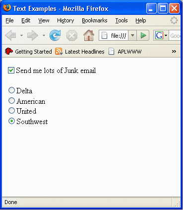
The input type of CHECKBOX lets you make checkboxes on your web page. There is a "checked" attribute that if set to "y" for yes makes the checkbox initially set. The name/value pair of a checkbox (or radio button) is only sent if the box is checked when the form is submitted. Note that this element consists of a checkbox only, and you will need to place text around it accordingly.
<input type="CHECKBOX" name="spam" value="send" checked="y" /> Send me lots of Junk email
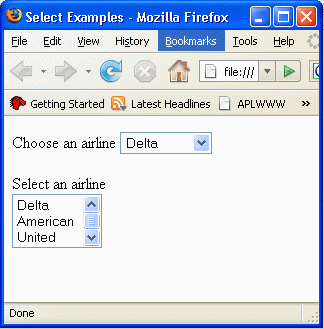
Radio buttons are very similar to checkboxes. The input type is "RADIO", and all radio buttons in a group should have the same name. It is the name field that makes the button a group. Only one button in a group can be pressed at a time, and you set a radio button checked by including a checked attribute.
<input type="RADIO" name="airline" value="Delta">Delta
<input type="RADIO" name="airline" value="American">American
<input type="RADIO" name="airline" value="United">United
<input type="RADIO" name="airline" checked value="Southwest">Southwest
Combo and List Boxes
GUI design guidelines dictate that radio buttons and checkboxes are usually preferred for speed and accuracy by users, but sometimes you just don't have the space to show all of your choices. This is where Combo Boxes and List Boxes come into play.
The Combo box format is to have a select tag followed by a single name attribute and a series of option tags with value attributes.
Choose an airline <select name="airlines">
  <option value="Delta">Delta</option>
  <option value="American">American</option>
  <option value="United">United</option>
  <option value="Southwest">Southwest</option>
</select>
A single name/value pair is sent to the server on form submission.
List boxes are very similar to Combo boxes. A list box is always visible. You use the same select statement but include the multiple attribute after the name attribute. You can specify how many items are viewable at a time with the size attribute. Since the user can now select multiple items at a time, a single name key is sent to the server, and the value field is a comma separated list of the selected values.
Select an airline<br>
<select name="airlines" multiple size="3">
  <option value="Delta">Delta</option>
  <option value="American">American</option>
  <option value="United">United</option>
  <option value="Southwest">Southwest</option>
</select>
Hidden Fields
One mysterious sounding type of form is a hidden filed. It's a way of embedding information in a form that will be sent on the next submission, and allows you to generate a page with hidden fields by a servlet and then the information can be passed to the next server request as a parameter in the GET/POST.
<input type=hidden name="message" value="hello">
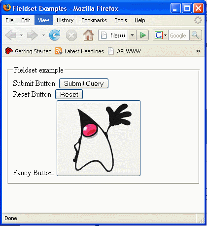
Fieldset
The <fieldset> tag may (or may not, depending on the browser) surround a grouping of elements with some type of border. This border may even contain a label (think of Borders in Swing) that is specified with the <legend> tag.
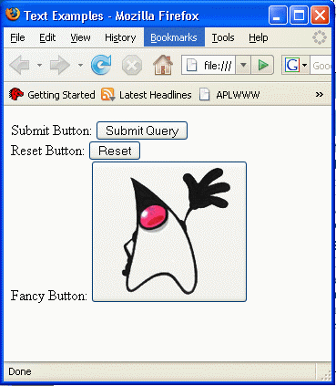
The code below
<fieldset>
<legend>Fieldset example
</legend>
Submit Button:  <input type="SUBMIT"  /><br>
Reset Button: <input type="RESET" /><br>
Fancy Button: <button type="SUBMIT"><img src="../Images/duke.gif"></button>
</fieldset>
Generates the following output
Tab order control
When you are filling data into a form, whatever component has the keyboard focus is the one that your keystrokes appear in. You can shift that focus by either using a mouse, or the TAB/SHIFT-TAB keys to cycle it from one component to the next.
By default, tabbing order shifts from component to component in the order that they appear in the document. Sometimes, this isn't what you want, and the tabindex value is used within component definitions to change this order. The value of the tabindex attribute is a positive integer indicating the position of the tagged contents in the overall tab sequence for the document. Same-valued tags are shown in the order they appear in the document.