Cascading Style Sheets
History
In the beginning, there was a blank page, and then text was added to the web page and the web designer was pleased, but not pleased enough, then block level tags were added….
HTML has evolved from simple markup, to a much more flexible system. Style sheets are used to control the overall look of a large set of HTML pages. These sheets can control colors, backgrounds and fonts across multiple documents.
In 1996, the World Wide Web Consortium (W3C) defined Cascading Style Sheets (CSS) for HTML.
CSS’s name itself implies the control of “style” in a document. Content is not affected, but how that content is rendered is affected
Use of Style Attributes
There are four ways to use style tags in a document
- Inline
- Document
- External style sheet
- IDs
Each one has it’s use, although the use of an external style sheet provides the most benefit to a web developer. One of the interesting things about styles is that you don't have to define all the attributes. A style can be used to define the italic trait of text, but apply it to <h1>, <p>, or any other tag that accepts a "class" attribute.
Inline style attributes
An inline attribute can be thought as one more variation on a block attribute, only it allows you to combine all of your markup as a single tag.
As the book showed you, the following style tells the browser to display the level-1 header text, “Great Day Hikes in the Tetons”, not only in the <h1> tag, but also colored blue and italicized:
<h1 style=”color: blue; font-style: italic”>Great Day Hikes in the Tetons</h1>
You could do this in old-style html attributes by doing the following
<h1><i><font color=”#0000FF”> Great Day Hikes in the Tetons</font></i></h1>
It turns out that the <i> and <font> tags have been deprecated in HTML 4 and XHTML in favor of the new style attributes.
Before we look at the actual use of styles in a document, let's see how we define a style first.
Style Attributes
Before we look at the formation of document or external rules, let's take a look at some of the attributes used within the rules. In the tables below, the default property for each attribute is in bold.
The table below lists attributes used when setting font values:
attribute |
function |
values |
| font-weight | relative boldness of font | normal | lighter | bold | bolder | 100 | 200 | … | 90 |
| font-style | font face within a family | normal | italic | oblique |
| font-size | relative or absolute size of font | xx-large | x-large | large | medium | small | x-small | xx-small | smaller | larger | size-value unit – Example => p { font-size : 14pt } |
| font-family | typeface family of font | – Example => h1 { font-family : Arial } |
The table below lists attributes used when setting text values:
attribute |
function |
values |
| text-decoration | text additions | none | underline | overline | line-through | blink |
| vertical-align | vertical position of element | top | bottom | baseline | middle | sub | super | ext-top | text-bottom | % |
| text-align | horizontal position of paragraph | left | right | center | justify |
| text-indent | indentation of first line of paragraph | +/- value unit – Example => p { text-indent: +25px } |
| line-height | distance between baselines in a paragraph | normal | value unit |
The table below lists attributes used when setting foreground/background values:
attribute |
function |
values |
| color | color of the text or foreground | color-name | #RRGGBB | #RGB | rgb(rrr, ggg, bbb) | rgb(rrr%, ggg%, bbb%) – Example => p { color : blue } p { color : #FF34A2 } |
| background-image | image to use as background | none | url(filename) |
| background-repeat | how to tile image in region | repeat | repeat-x | repeat-y | norepeat |
| background | combine previous two properties | Example => p { background : url(bluedot.gif) repeat-x } |
The following attributes are used with things like images. They allow the user to control the size of the object itself and margins around the object.
attribute |
function |
description |
| top, left, bottom right | position element | Allows you to absolutely place an element |
| height, width | absolute or relative size of element | For most elements, height is automatically determined by the browser. For images, the height is intrinsic, and will only change if the author declares a specific height value which is different than the intrinsic height. |
| margin, margin-top, margin-bottom, margin-left, margin-right | value unit | <img src="pic7.jpg" style="margin-top: -50px;"> |
The following suffixes can be used to express size in the above tables of attributes
suffix |
Description |
| px | Pixels (relative unit) |
| pt | Points; 72 points per inch (absolute unit) |
| mm | Millimeters (absolute unit) |
| in | Inches (absolute unit) |
| ex | The height of the letter “x” in the current font (relative unit) |
| em | The height of the current font (relative unit). This supposedly makes using large fonts easier, as the page size is defined as a function of font size. |
| cm | Centimeters (absolute unit) |
| % | % current size |
Document Style Rules
To define a set of rules used in a document, you need to first define a style section within the <head> part of your HTML document.
<head>
...
<style type="text/css">
<!--
h1 { text-align: center; background: #000000; color: #FF0000 }
p.style1 {font-size: large}
.style2 {font-size: xx-large;
font-weight: bold;
}
.Courier {font-family: "Courier New", Courier, mono}
.Font12pt {font-size: 12pt}
-->
</style>
...
</head>
The style section above first defines the type as "text/css", and then defines five styles that can be used in the document.
To override an existing style attribute, such as the h1 entry above, you can just redefine it in the style rules. In the example above, the use of the <h1> attribute will result in the default h1 font size, but with it aligned and with a background color of black and a foreground of red.
The next option is to define an element style class and proceed the HTML element by a period and a class name. This lets you have finer control over the use of a style. Once defined, you can refer to the style class in the CLASS attribute of the HTM element
<p class="style1">
The above tag would apply the style1 style to the specified paragraph.
The last option is to define an global style class. This is identical to the element style class, but it is not proceeded by an attribute in front of the style name. In the example above, .style2 is a global style class that can be applied to any element by using the class="style2" attribute.
<p class="style2">
<h1 class="style2">
IDs
An ID is like a class, but can be applied only once in a document
<head>
...
<title>...</title>
<style type="text/css">
<!--
#foo
-->
</style>
</head>
<body>
...
<p id="foo">
...
</body>
External Style Sheets
Lastly, you can define your styles in a separate document, and import them into as many HTML/XHTML documents as you'd like. The format is very much like the document style sheets.
All you need to do is open a file, let's call it mystylesheet.css and place the rules in the file. You can put @charset "utf-8" to specify the character set used in the document. The following defines four global styles.
@charset "utf-8";
/* CSS Document */
.Normal {font-size: large}
.NormalBlue {font-size: large; color: #0000FF}
.NormalBold {font-size: large; font-weight: bold; }
.NormalItalic {font-size: large; font-style: italic; }
To use the external style sheet in a file, you place a single tag in the <head> section of your HTML/XHTML document. Normally you tend to use the <link> attribute to link in and use a single style sheet, it is possible to use an @import statement, but I'll talk about that later. Some versions of IE don't recognize the @import attribute.
<head>
...
<link href="mystylesheet.css" rel="stylesheet" type="text/css" />
...
</head>
The use of an external style sheet allows you to make site-wide changes in the look of your documents by changing only a single file.
If you use the @import method, you can import multiple stylesheets much easier. This page that you are reading uses the following code at it's top.
<title>Cascading Style Sheets</title>
<style type="text/css">
<!--
@import url("../stylesheets/jhu.css");
@import url("../stylesheets/course.css");
-->
</style>
</head>
This uses three stylesheets. The first is actually a copy of the second, but is used if internet connectivity is not present. The last is used to override or modify the style sheet that is used for all Blackboard based classes. Notice this way uses the <style></style> attributes like local definitions do.
Multiple Style Sheets
It's worth mentioning that you can link/import multiple style sheets. When you link/import a style sheet, it is actually the second document, because the browser already has one. User defined styles override browser preferences, and more specific rules have precedence over less specific rules.
If you use the <link> attribute, then the browser should present the user with a list of all the linked style sheets, and the user then selects one of them. If you use the @import statement, it actually merges all of the style documents into one.
Span tag
The <span> tag is a generic inline tag. It lets us mark an arbitrary section of HTML for styling. It just serves to mark the beginning and ending location of a style.
Note the use of the CSS style tag
<style type="text/css>

<!-- span.red {color: #ff0000} -->

</style>
...
<body>
<p>Now is the time for all <span class="red">good men</span> to come to the aid of their country</p>
This will produce an output that looks like
Now is the time for all good men to come to the aid of their country
Div tag
The <div> tag is the generic block tag, it defines a "box" of HTML and is a common layout tool. All of a div's formatting is done through style sheets. Div elements are block elements and group other tags together. <div> tags only divide content, you must use CSS styles to define how the content is laid out in the <div> tag. The only tags you should actually use within the <div> tag are as follows:
- id
- width
- height
- title
- style
Typically, <div> will have very little in it. It's easiest use is to define "blocks" of code. Since the division take up 100% of the space, you can see the effects of <div> tags by setting the background color of the <div> with the style attribute.
The samples below are a bit more complex than you are responsible for in class, and are included to show you the capabilities of <div> tags and CSS styles.
Take a look at the code below. Note the use of the CSS styles to define colors, and then applying those styles to the <div> tags in the document.
<!DOCTYPE HTML PUBLIC "-//W3C//DTD HTML 4.01 Transitional//EN" "https://www.w3.org/TR/html4/loose.dtd">

   <html>

   <head>

   <meta http-equiv="Content-Type" content="text/html; charset=utf-8">

   <title>Untitled Document</title>

   <style type="text/css">

   <!--

   body  {

 font: 100% Verdana, Arial, Helvetica, sans-serif;

 background: #666666;

 margin: 0; /* it's good practice to zero the margin and padding of the body element to account for differing browser defaults */

 padding: 0;

 text-align: center; /* this centers the container in IE 5* browsers. The text is then set to the left aligned default in the #container selector */

 color: #000000;

 }
 .test #first {

   background: #FF0000; /* the background color will be displayed for the length of the content in the column, but no further */

   padding: 15px 10px 15px 20px;

 }

 .test #second {

   background: #FFFFFF;


   padding: 15px 10px 15px 20px; /* remember that padding is the space inside the div box and margin is the space outside the div box */

 }

 .test #third {

   background: #0000FF;

   padding: 15px 10px 15px 20px; /* remember that padding is the space inside the div box and margin is the space outside the div box */

   }

 .fltrt { /* this class can be used to float an element right in your page. The floated element must precede the element it should be next to on the page. */

   float: right;

   margin-left: 8px;

 }

 .fltlft { /* this class can be used to float an element left in your page */

   float: left;

   margin-right: 8px;

 }

 .clearfloat { /* this class should be placed on a div or break element and should be the final element before the close of a container that should fully contain a float */

   clear:both;

   height:0;

   font-size: 1px;

   line-height: 0px;

 }

 -->

 </style>

 </head>
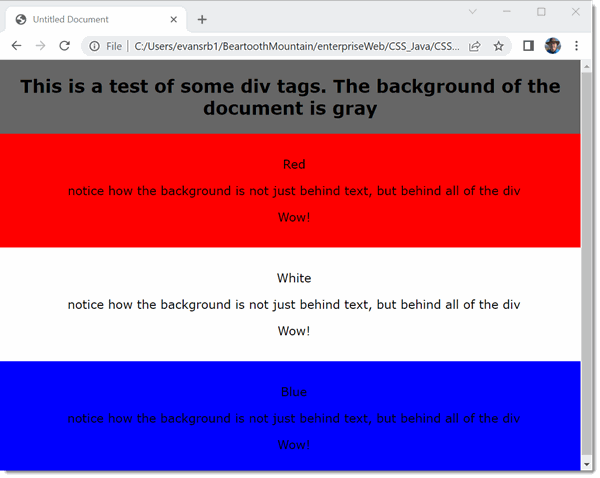
<body class="test">

   <h2>This is a test of some div tags.  The background of the document is gray</h2>

   <div id="first">

   <p>Red</p>

   <p>notice how the background is not just behind text, but behind all of the div</p>

   <p>Wow!</p>

   </div>

   <div id="second">

   <p>White</p>

   <p>notice how the background is not just behind text, but behind all of the div</p>

   <p>Wow!</p>

   </div>

   <div id="third">

   <p>Blue</p>

   <p>notice how the background is not just behind text, but behind all of the div</p>

   <p>Wow!</p>

   </div>

   <br class="clearfloat" />
</body>

</html>
When you run the code in a web browser, you get the following output:
You can get even more interesting results when you use the "float" attribute of a CSS style. When applied to a <div> tag, you can get "columns" of layouts similar to tables and frames.
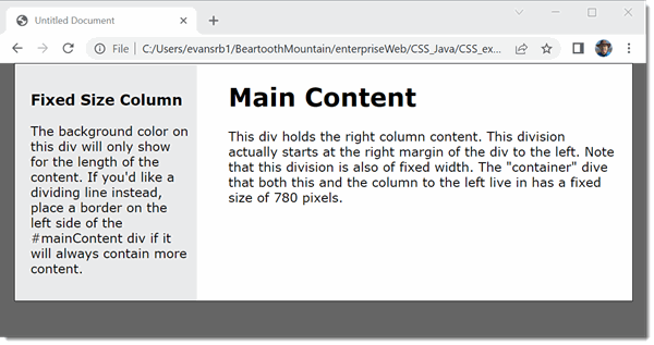
The code below generates two <div> columns contained in a "container" div of fixed width.
<!DOCTYPE HTML PUBLIC "-//W3C//DTD HTML 4.01 Transitional//EN" "https://www.w3.org/TR/html4/loose.dtd">

<html>

 <head>

   <meta http-equiv="Content-Type" content="text/html; charset=utf-8">

   <title>Untitled Document</title>

   <style type="text/css">

   <!--

   body  {

      font: 100% Verdana, Arial, Helvetica, sans-serif;

      background: #666666;

     margin: 0; /* it's good practice to zero the margin and padding of the body element to account for differing browser defaults */

     padding: 0;

     text-align: center; /* this centers the container in IE 5* browsers. The text is then set to the left aligned default in the #container selector */

     color: #000000;

   }

   .twoColFixLt #container {

     width: 780px;  /* using 20px less than a full 800px width allows for browser chrome and avoids a horizontal scroll bar */

     background: #FFFFFF;

    margin: 0 auto; /* the auto margins (in conjunction with a width) center the page */

     border: 1px solid #000000;

     text-align: left; /* this overrides the text-align: center on the body element. */

   }

   .twoColFixLt #sidebar1 {

     float: left; /* since this element is floated, a width must be given */

     width: 200px; /* the actual width of this div, in standards-compliant browsers, or standards mode in Internet Explorer will include the padding and border in addition to the width */

     background: #EBEBEB; /* the background color will be displayed for the length of the content in the column, but no further */

     padding: 15px 10px 15px 20px;

   }

   .twoColFixLt #mainContent {

     margin: 0 0 0 250px; /* the left margin on this div element creates the column down the left side of the page - no matter how much content the sidebar1 div contains, the column space will remain. You can remove this margin if you want the #mainContent div's text to fill the #sidebar1 space when the content in #sidebar1 ends. */

     padding: 0 20px 20px; /* remember that padding is the space inside the div box and margin is the space outside the div box */

   }

   .fltrt { /* this class can be used to float an element right in your page. The floated element must precede the element it should be next to on the page. */

     float: right;

     margin-left: 8px;

   }

   .fltlft { /* this class can be used to float an element left in your page */

     float: left;

     margin-right: 8px;

   }

   .clearfloat { /* this class should be placed on a div or break element and should be the final element before the close of a container that should fully contain a float */

     clear:both;

     height:0;

     font-size: 1px;

     line-height: 0px;

   }

   -->

 </style>

</head>
<body class="twoColFixLt">
<div id="container">

   <div id="sidebar1">

   <h3>Fixed Size Column</h3>

   <p>The background color on this div will only show for the length of the content. If you'd like a dividing line instead, place a border on the left side of the #mainContent div if it will always contain more content. </p>

   </div>

   <div id="mainContent">

   <h1> Main Content </h1>

   <p>This div holds the right column content.  This division actually starts at the right margin of the div to the left. Note that this division is also of fixed width.  The "container" dive that both this and the column to the left live in has a fixed size of 780 pixels.</div>

   <!-- This clearing element should immediately follow the #mainContent div in order to force the #container div to contain all child floats --><br class="clearfloat" />

   <!-- end #container --></div>

</body>

</html>
When run in a browser, the code above produces the following output:
More Examples
CSS can be quite intimidating, because there are a LOT of different settings, all of which contribute to the final look.
As an example, consider the CSS style sheet below
body {
font-family: Arial, Helvetica, sans-serif;
}td {
font-family: Arial, Helvetica, sans-serif;
}th {
font-family: Arial, Helvetica, sans-serif;
}
When used, it provides a very plain HTML document as shown below. Here is the link to the html document so you can view it in your browser as well.
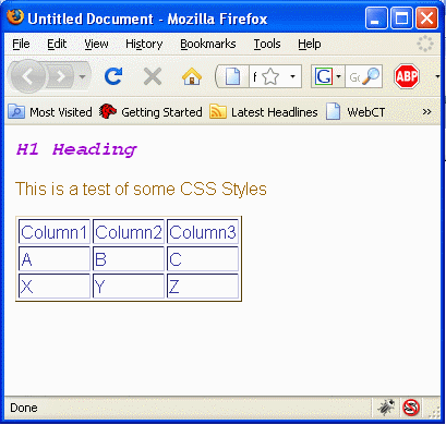
If we define a more complex CSS sheet, we can start to modify the document. Using the CSS below
body {
font-family: Arial, Helvetica, sans-serif;
cursor: crosshair;
margin-left: 10px;
color: #996600;
}td {
font-family: Arial, Helvetica, sans-serif;
color: #333399;
}th {
font-family: Arial, Helvetica, sans-serif;
background-color: #9999FF;
border-color: #003399;
color: #000000;
}h1 {
font-family: "Courier New", Courier, monospace;
font-size: 18px;
font-style: italic;
font-weight: bold;
color: #9900CC;
}
.custom_h1 {
font-family: Arial, Helvetica, sans-serif;
font-size: 36px;
color: #33CC00;
}
The CSS statements above first set a default font, color, margin and cursor for the document. I have modified the td and th elements to show different colors, as well as redefine the <h1> tag.
I've also added a custom class "custom_h1", which I'll use on one of the <h1> lines in the document. After adding a few new lines to our original plain document, we can get something like this.